Sarvam AI Brand Guidelines and Assets

A New Identity for Sarvam
Sarvam is dedicated to developing world-class AI from India, with the depth, rigor, and ambition required to lead at the frontier. What excites us is the opportunity to build AI that reflects how this country thinks, speaks, reasons, and solves problems, and to do so at a level of technical excellence that stands alongside the best in the world.
As our work has evolved, our brand identity has evolved with it. The update reflects both our mission and the Sarvam we are building today.
The vision
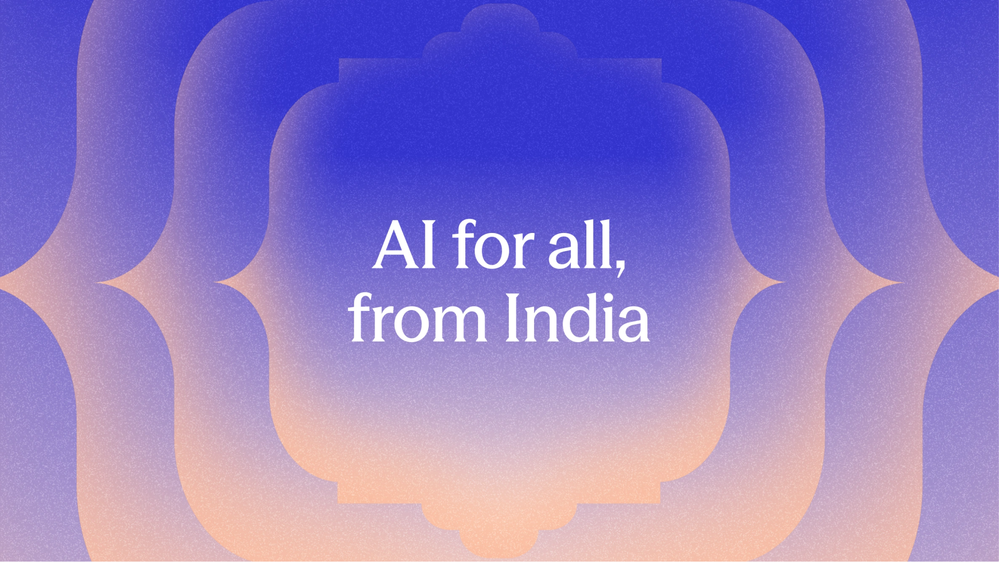
AI for all from India
Sarvam means all. It is a Sanskrit word that carries the idea of wholeness, everything, everyone, everywhere, and it sits at the core of our vision.
As Sarvam evolved, it became obvious that our identity needed to do more than look contemporary or polished. It needed to feel like an extension of the same thinking that guides our models and products. If our work is about building AI that reflects the country it serves, then the brand had to do the same. It had to feel grounded, familiar, and modern at the same time, without leaning on nostalgia or spectacle.
Designing for Breadth and Depth
The brand needed to hold many things at once. It had to be comprehensive enough to span multiple products and use cases. It had to be cohesive enough to earn trust across audiences. It had to be flexible enough to evolve without losing its identity. And it had to feel rooted in India without relying on nostalgia or symbolism for its own sake.
The design process followed this logic. We studied language, form, rhythm, and structure. We looked across regions, crafts, scripts, and everyday visual systems. We paid close attention to how information is presented, how complexity is handled, and how meaning is conveyed without explanation. The goal was to design something that feels natural in its context, familiar, legible, and capable of carrying the scale of what Sarvam is building.
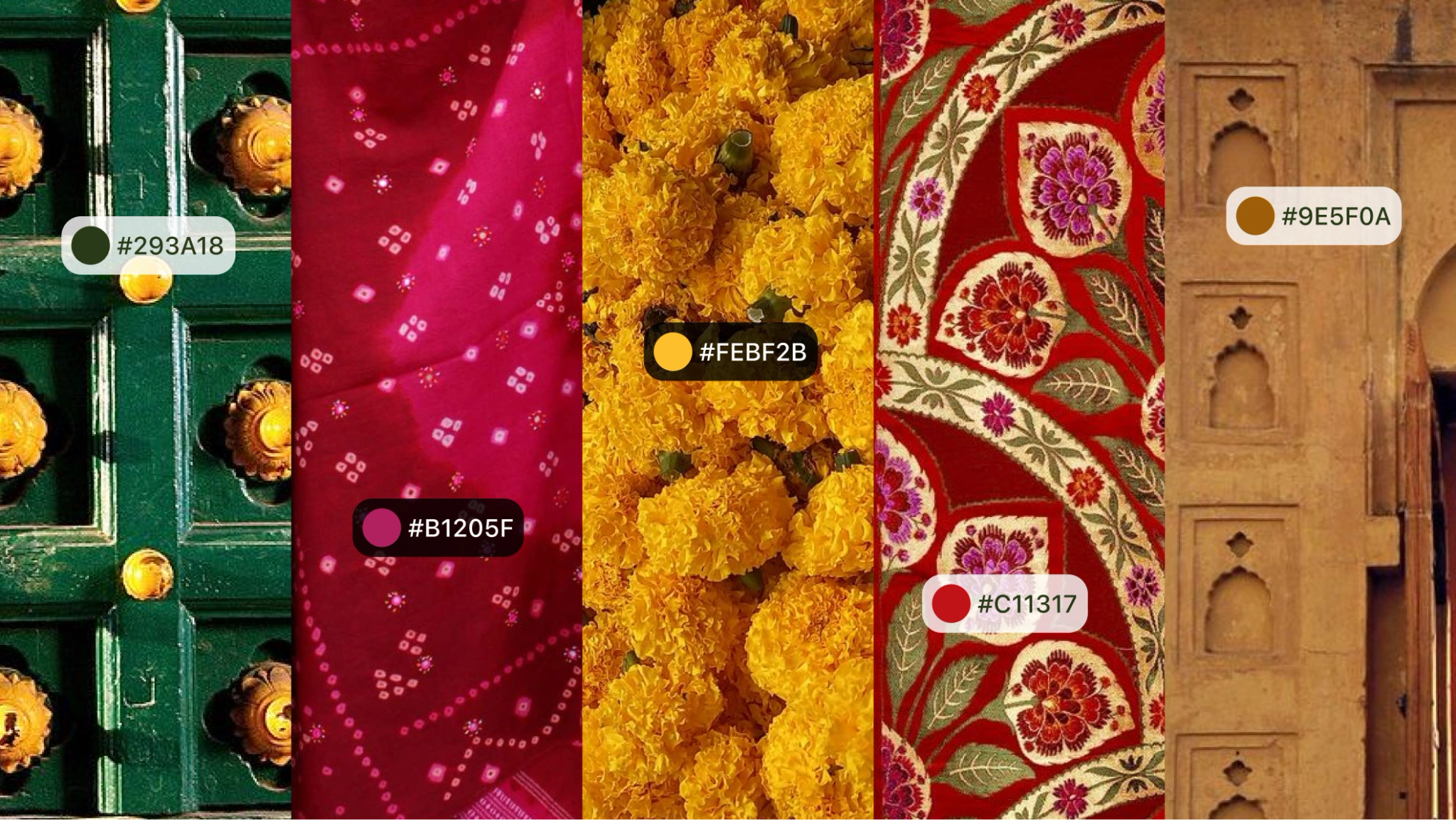
We explored a wide range of symbols, languages, monuments, motifs, textiles, tiles, regional references, and cultural forms, spanning different places and periods. Many directions felt too region-specific. Others were visually rich but overly decorative. Some carried meaning on their own but could not scale as a system. What we were looking for was something that could connect across generations. Something that felt shared rather than selective, and broad enough to belong to everyone.
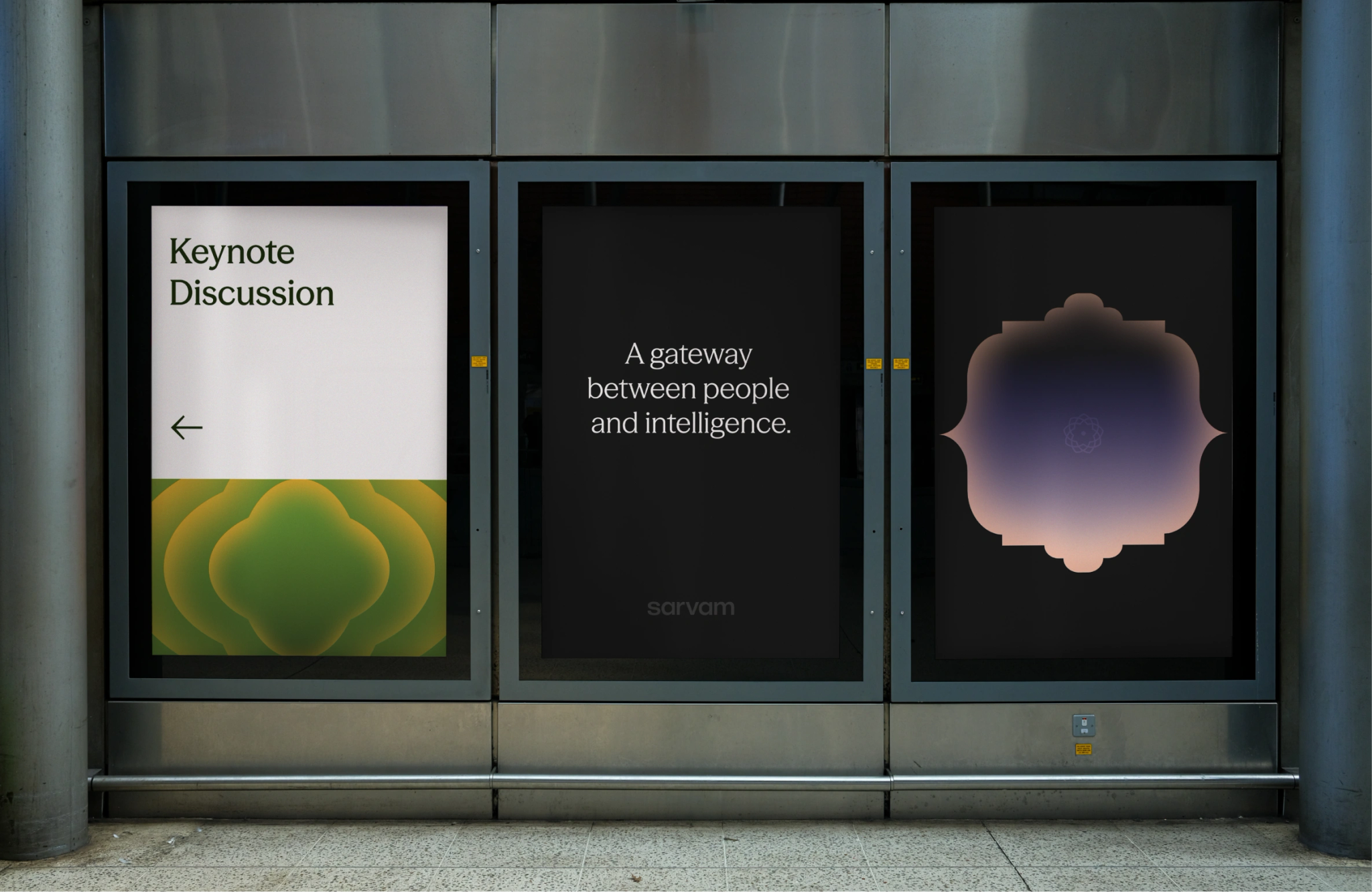
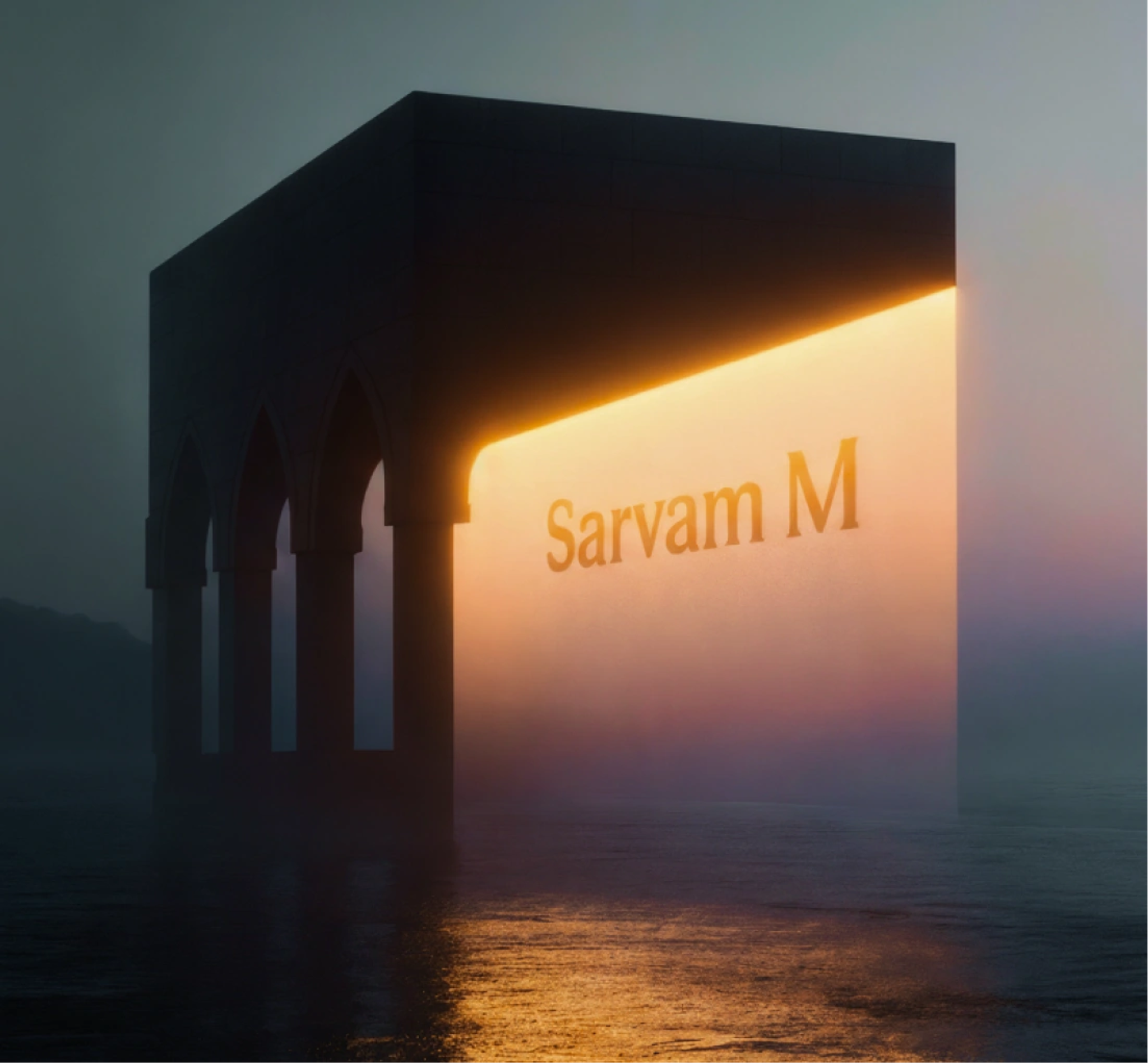
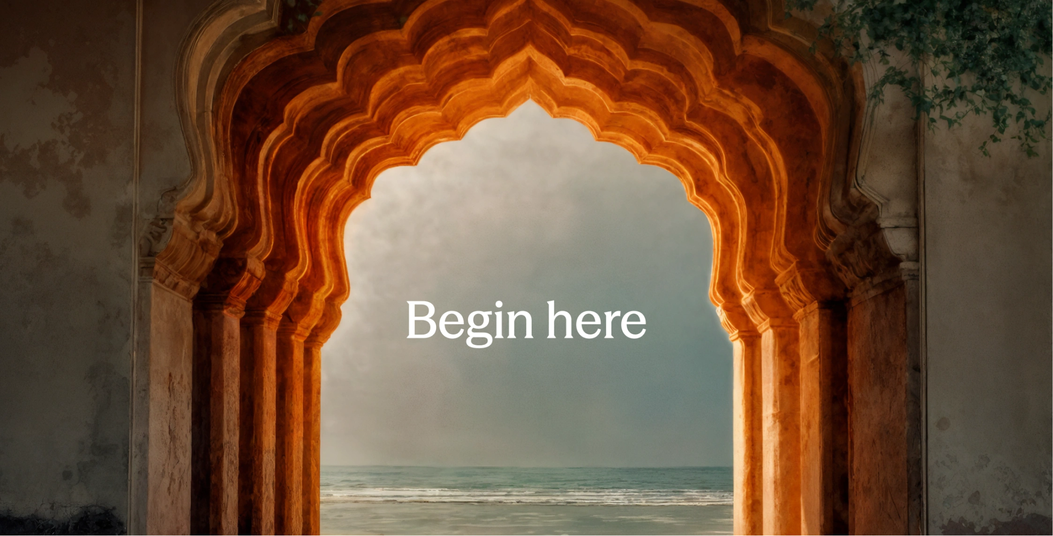
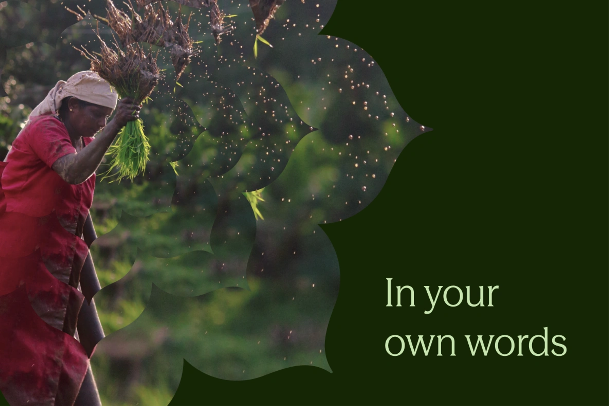
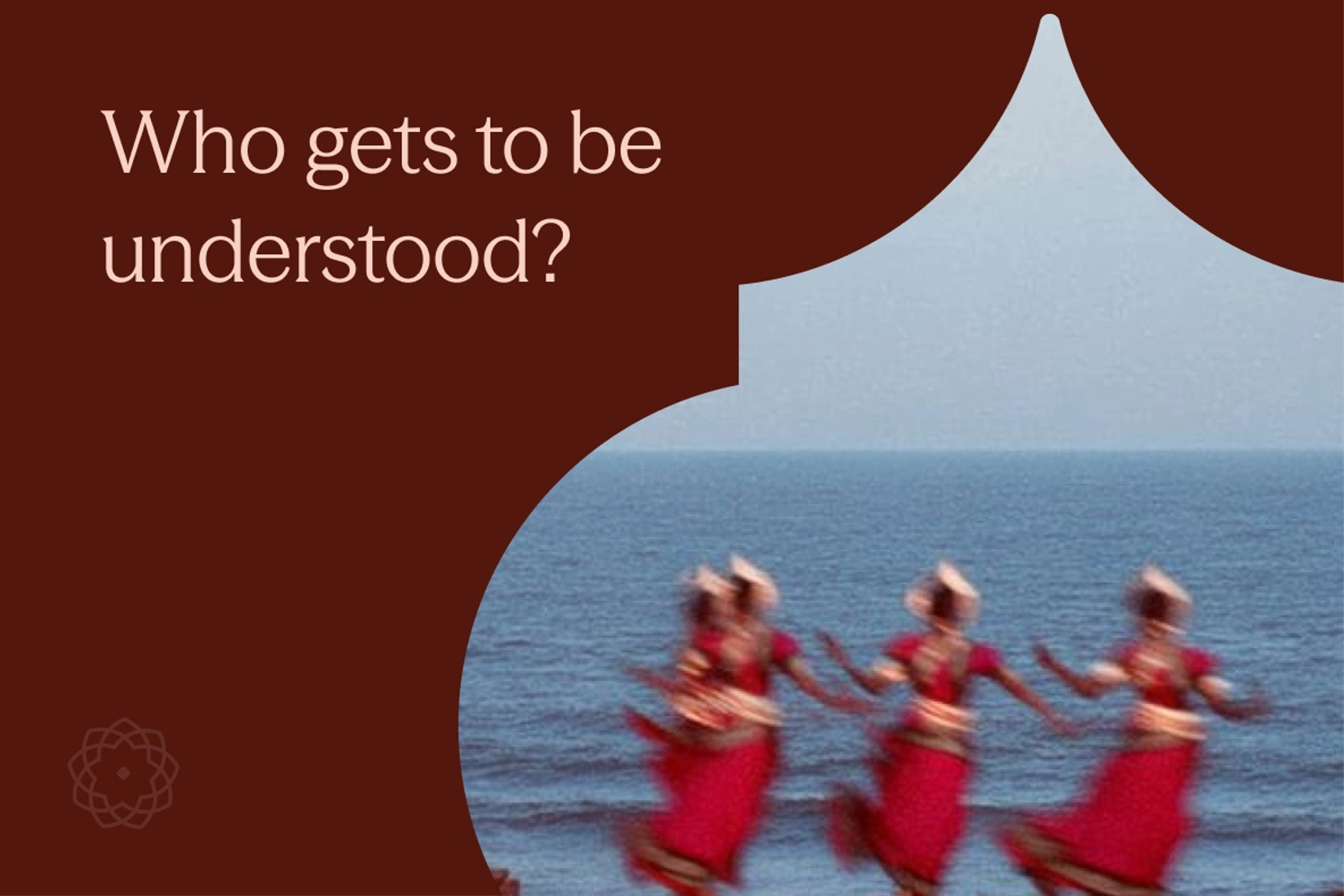
The Gateway Between Worlds
After extensive exploration and iteration, one idea consistently brought everything together. The gateway.
Architectural gateways are a familiar presence across Indian life. They appear in public spaces, streets, shops, and graphic culture, not as decoration, but as structure. They are widely recognizable without being tied to a specific region or tradition, and they scale naturally from the everyday to the monumental. For us, the gateway became a way to express inclusivity and openness while retaining clarity and discipline.
A gateway is more than a form. It represents a moment of transition, where two worlds move toward each other. Human and machine. Culture and computation. What already exists and what is still emerging.
The Visual System
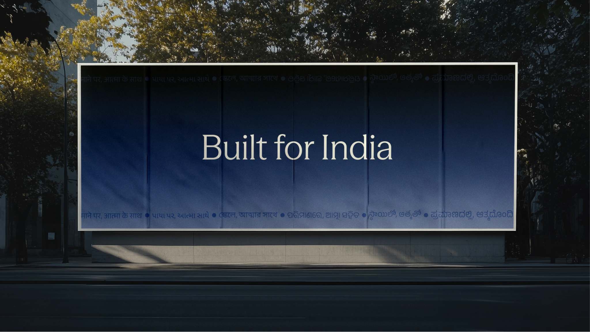
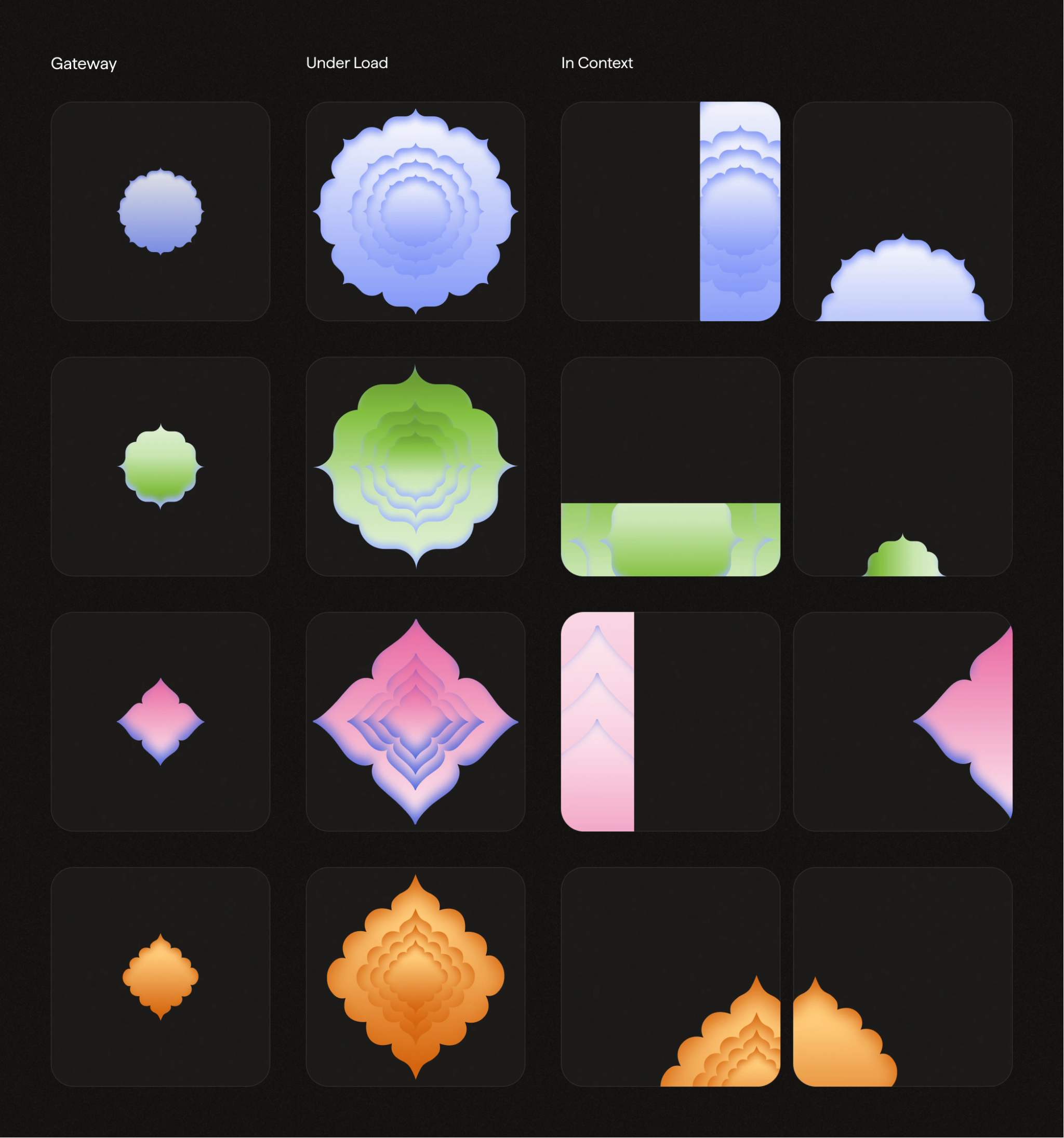
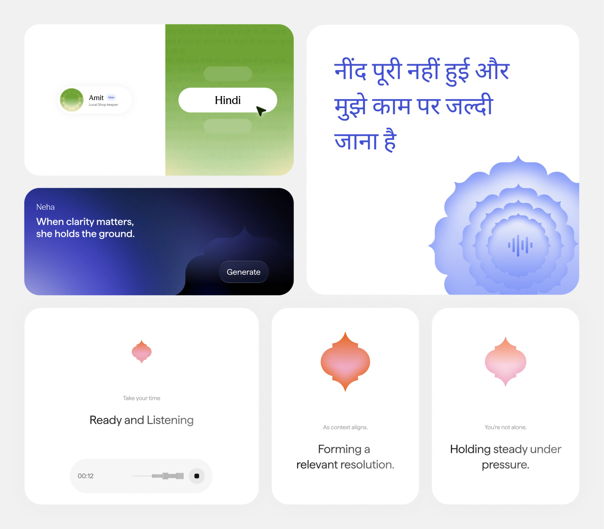
The visual system uses a blue-to-orange spectrum as a foundational language. Instead of relying on fixed color blocks, it operates through continuous transitions in light and tone. These shifts communicate motion, energy, and progression, reflecting how interactions evolve over time.
The visual system is built on a simple construction logic, drawing inspiration from the mandala. A mandala is intricate, multi-layered, and deeply intentional. Each pattern interlocks with another, each layer reveals more meaning. What looks abstract at first gains coherence only when viewed as a whole. You don’t rush a mandala. You build it with patience, knowing it will eventually turn into something meaningful and complete.
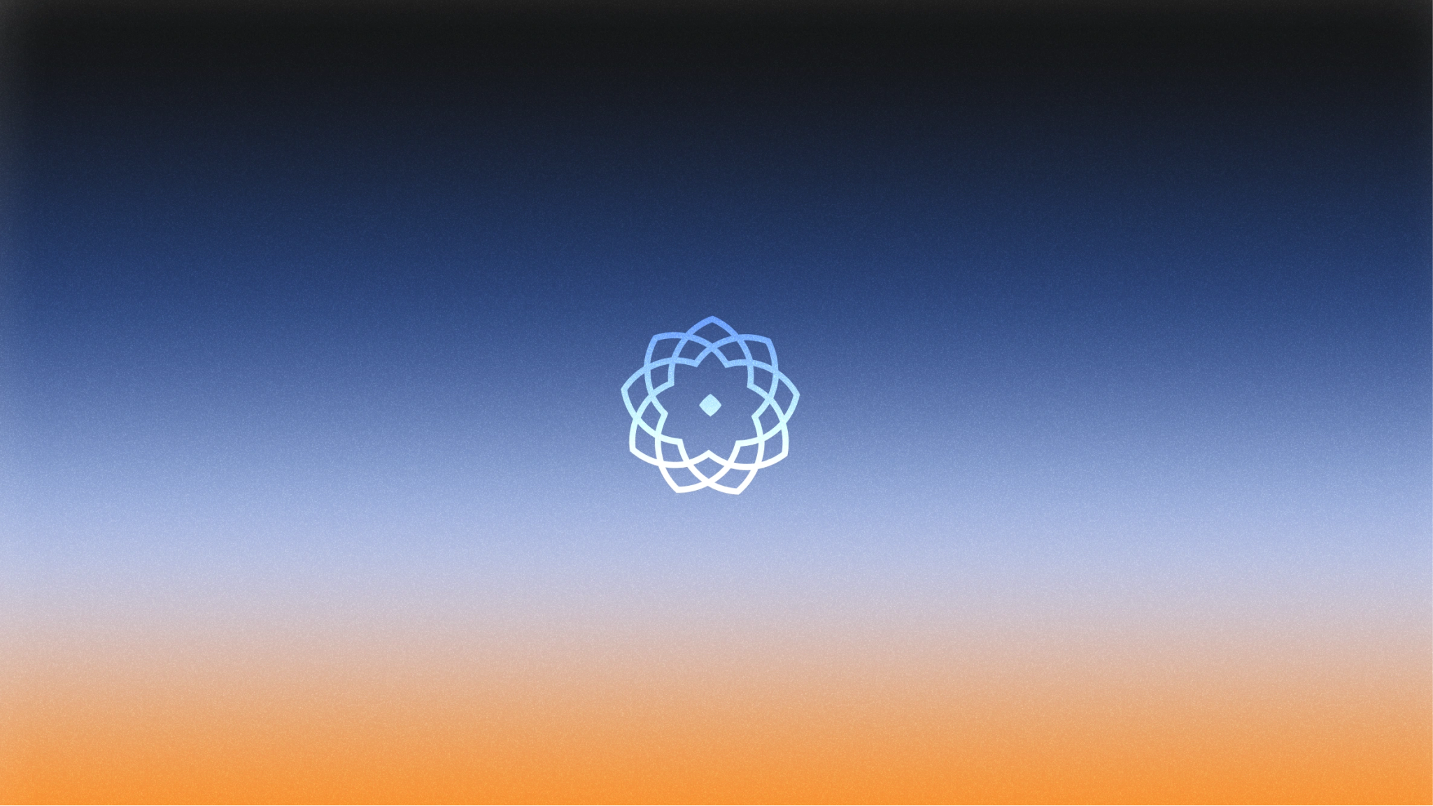
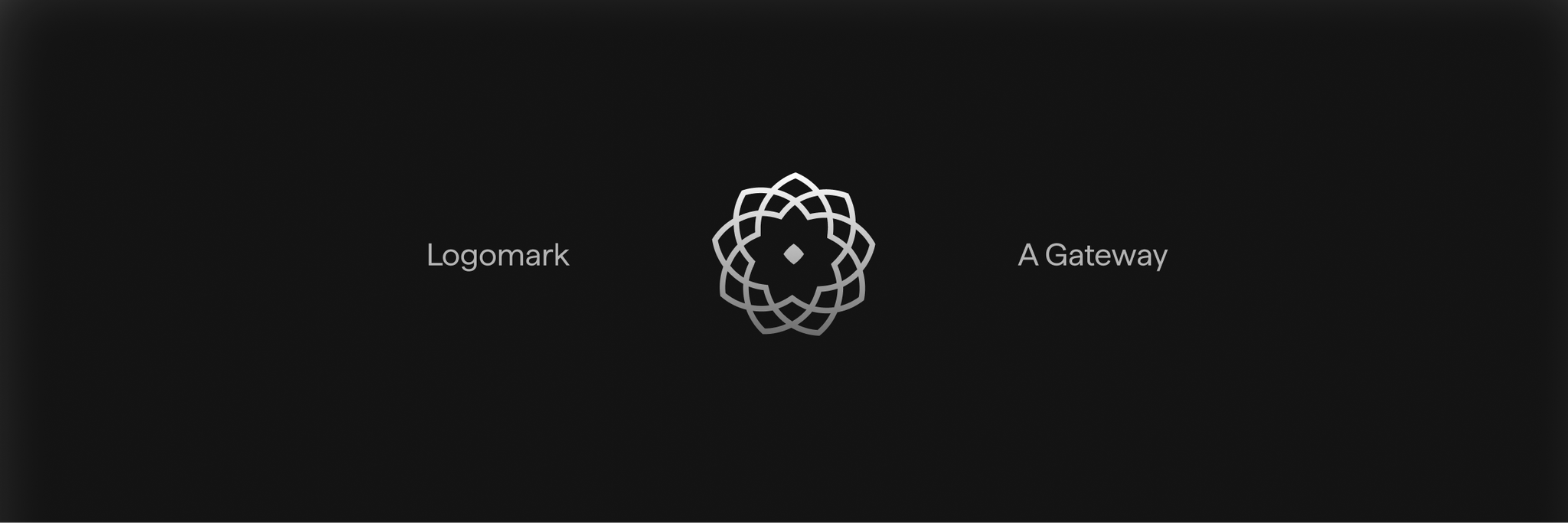
Monogram
Timeless construction, contemporary meaning
The monogram is formed from repeated circles, arranged with geometric discipline and guided by the same underlying principles found in mandala construction. From this repetition emerges a lotus-like form that reflects a balance we kept returning to throughout the process.
This idea of layered meaning carries through the rest of the system.
Our visual behavior emphasizes movement and transformation. A blue-to-orange gradient forms a continuous spectrum rather than a set of discrete blocks. Transitions in light and color express motion, change, and shifting states of interaction. These transitions are not decorative. They function as signals of flow, helping the system feel responsive and alive.
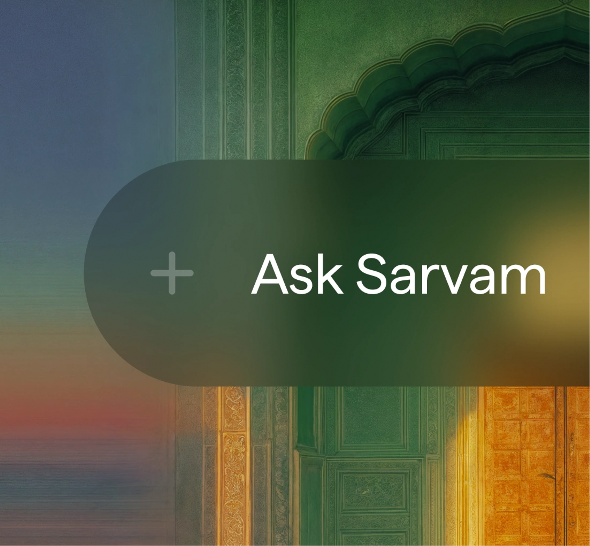
Wordmark
A modern expression
The wordmark is designed as a contemporary expression of Sarvam. Wider letterforms give it clarity and presence, while balanced proportions and carefully refined curves ensure consistency across contexts. Every detail, from spacing to structure, is tuned to perform reliably across digital products, brand communication, and physical environments.
A brand can’t do the work itself, but it can shape how people understand the work and whether they see themselves in it. We built this identity to grow with Sarvam and to hold the breadth of what we’re building while staying true to where we come from. AI for all from India. The work continues. This is how we show up for it.